While its no secret I love Pinterest for inspiration boards, there’s one place I always look to for color inspiration for new projects and ONE place I send clients who are searching for that ‘just’ right color combination. That’s COLOURlovers! Millions of bits of inspiration, from pros and those who just love color!
Since today is Valentine’s Day, I’d thought I’d share the love with some of my favorite color pallettes from COLOURlovers and links back to the original artist. You can see these inspirations in use in our portfolio. If you’re out to make a statement with your website, do it with color, be sure you bookmark your favorites !
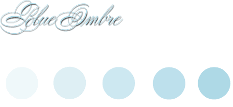
Ombre is HOT. Pick a color then find its closest five neighbors in tone and tint. Aurora Ombre is a great example, just google ombre and you’ll find thousands of examples!
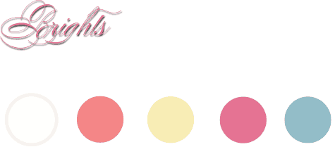
Bright tones are joyful. Bring life to your site using spots of Bright tones. This pallette was pulled from a Walt Disney Letterhead. Naturally!
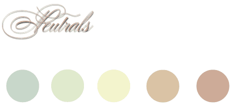
Sometimes a neutral pallette is what you need to calm your spirit and get your point across. This one says it beautifully!
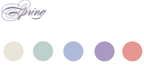
Ahhhhhhhh the Italians !! (you really didn’t think I could leave them out did you?) Missoni is young and vibrant and this pallette says it all!
So there ya have it. Some of my favorite color pallettes. What are yours? Feel free to link them up in the comments!
